

As more podcasts expand to YouTube, creators face a new design challenge. Thumbnails must attract clicks in a crowded video feed while also reinforcing brand identity across podcast platforms. A hybrid strategy ensures that your visuals work in both environments, driving YouTube clickthrough rates while strengthening recognition in podcast directories.
Design for Clicks Without Sacrificing Brand Consistency
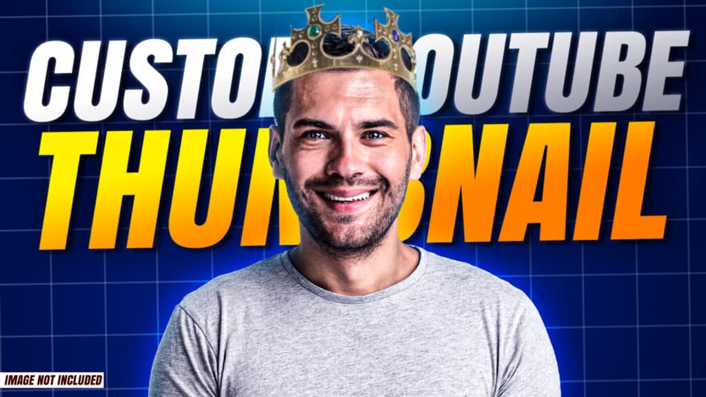
On YouTube, thumbnails compete with dozens of other videos. Bold text, expressive faces, and high contrast colors help grab attention. However, your thumbnail should still align with your podcast artwork and overall visual identity.
Use consistent fonts, color palettes, and logo placement across episodes. This consistency builds familiarity, which increases the likelihood that viewers will click again in the future.
Balance Episode Specificity With Series Recognition
YouTube favors thumbnails that clearly signal what the video is about. Include a short, punchy phrase that highlights the episode’s main idea or hook. Avoid clutter. Three to five strong words are usually enough.
At the same time, keep a recognizable layout structure so your episodes feel connected. This could be a recurring banner, a fixed corner logo, or a consistent host image placement.
Optimize for Multiple Viewing Sizes
Your thumbnail will appear at different sizes across devices. On mobile, it may be smaller and harder to read. Test your design at a reduced scale to make sure the text remains legible and the focal point remains clear.
For podcast RSS discovery, strong visual branding also matters. Even though many podcast apps display square artwork rather than custom thumbnails, consistent visuals across platforms reinforce brand recall and make your show easier to recognize when listeners search by name.
Align Titles and Visual Hooks
Your thumbnail and episode title should work together. If your title explains the topic, your thumbnail can amplify the emotional angle. If your thumbnail features a bold statement, your title can provide clarity.
This alignment improves clickthrough on YouTube while strengthening the perceived professionalism of your show across platforms.
Final Thoughts
Hybrid thumbnail strategies are about balance. You want to attract new viewers in fast-moving video feeds while maintaining a cohesive identity that supports long-term podcast growth. With thoughtful design, clear messaging, and consistent branding, your visuals can become one of your strongest tools for discoverability and audience retention.
Looking to take your show to the next level? Book a session at Modern Stoa Podcast Studio. Go to modernstoa.co/studio.